| Author |
**MaryJanesFarm Products & Merchandise:  We need your help with our cover! UPDATE! We need your help with our cover! UPDATE!  |
|
Dorinda
True Blue Farmgirl

1023 Posts
Dorinda
St. Cloud
Florida
USA
1023 Posts |
 Posted - Jul 27 2011 : 07:30:59 AM Posted - Jul 27 2011 : 07:30:59 AM

|
I vote without the bar!
Seize The Day!
Dorinda |
 |
|
|
SRhea
Farmgirl in Training

42 Posts
Sue
San Angelo
TX
USA
42 Posts |
Posted - Jul 27 2011 : 07:39:45 AM
|
Without the bar.
In one of your magazines you wrote about paper towels and I believe it was under Simple Solutions. I have been trying to find it again to reread it and don't remember what issue it was in. Is it on the website? |
|
|
|
ceejay48
Farmgirl Legend/Schoolmarm/Sharpshooter
13586 Posts

CeeJay (CJ)
Dolores
Colorado
USA
13586 Posts |
|
|
BasicBliss
Farmgirl at Heart

4 Posts
4 Posts |
Posted - Jul 27 2011 : 9:04:46 PM
|
I like having a vote. Like others I prefer the look of no bar, but the bar does make the text easier
to read.
--Victoria
What if the Hokey Pokey IS what it's all about? |
|
|
|
sissysquilts
True Blue Farmgirl

368 Posts
sissy
wa
USA
368 Posts |
Posted - Jul 28 2011 : 11:28:41 AM
|
without the bar :)
"The good stars met in your horoscope. Made you of spirit,fire and dew"
Robert Browning |
|
|
|
Lady Woodworker
True Blue Farmgirl
259 Posts
Karen
Chamberlain
Maine
USA
259 Posts |
Posted - Jul 28 2011 : 1:21:54 PM
|
It isn't about the bar--it's about overall impressions.
I gave myself a little test to determine my impressions.
First, I read the bar on Vol. 10, #4.
Next, I read the article titles list on the (non-barred) cover below it; Vol. 10, # 2.
Then I turned away and wrote down any article titles I could remember.
Checking back, I remembered more titles from the barred cover than the open cover.
However,
I repeated this test with the next two: Vol. 10, #6 and Vol. 9 #5.
This time the article titles on the cover without the bar stuck with me better.
Why?
I think it has much to do with the fact that the rich backdrop of the farm field gave an uncluttered background for the article titles to stand out.
I would have descended the titles differently (not placed "Invest in Happy Cows" exactly next to MJ) but overall, this is may be the richest, most effective cover I have seen from MJF. (I bought it).
Another reason I remembered more titles from this cover must be that I stared at this cover MUCH longer. It is beautiful in many, many ways. The title bar is glorious and its color and trim is in fine harmony with the image below/ the image the issue wishes to covey, I think. All the fonts on this cover are also well-chosen and nicely sized too.
The other open cover (Vol. 10, #2) is, in my opinion, far too cluttered.
That cover would actually be better served with a bar.
Only the right side of the image (MJ sitting atop a nice old chest, looking pleasant and pretty, holding a treasured book next to a wonderful bouquet) has power.
The rest (including the street sign in the strongest part of the image) is clutter.
The overall impression is that we are closer to discards than decor here and all is discordant since the lead title is "Journal your Dream Farm" (not "Decor from Discards").
With a bar in place, "Journal your Dream Farm" (A positive and enticing lead title) would fit with the image (sans the street sign).
The bar on Vol. 10, #6 is probably the best choice for this foreshortened, strong close-up. In my memory test, I'll bet if I had matched this with any other cover (other than the rich brown farm field I so love) I would likely find myself remembering more article titles from this cover. I think this cover is really good.
In general though, while the bar provides an easy way to grab a reader's attention, I rarely enjoy them.
I appreciate the thoughtfulness that produced the cover on Vol. 9, # 5.
The cover with the Jane Deere hat--because there is a nice, big swath of green behind Jane Deere--might lend nicely to having no bar. I'd have to see it without the bar to know for sure but I think so.
But even with that, I'm not sure I would like this cover. This is my least favorite one of the four.
MJ is often successful with big hats and little eye contact--but she usually offers the possibility of eye contact--and that may be the difference. I had a visceral feeling against this cover at first sight.
In summary, I think the success of your covers goes much deeper than "Bar or no Bar." It is an overall feeling that I think you are very successful in capturing most of the time.
I like a lot of the comments in this thread and yes, the bar does make the article titles easier to read.
But just as typing isn't the same thing as writing, cover clarity is not the same as cover interest.
I took the memory test to gauge impressions--because impressions sell magazines.
I hope this is of some help to you. You certainly are wise to poll readers in this way. It shows a great deal of care on your part--and I applaud you for it.
Warmly,
Karen Wales
Farmgirl Sister # 2419 |
|
|
|
Carol
Moderator/MaryJane's Design Diva

452 Posts
Carol
Moscow
Idaho
USA
452 Posts |
Posted - Jul 28 2011 : 2:44:16 PM
|
Wow, Lady Woodworker - thanks for your very thoughtful, concise, and detailed evaluations of our covers!
"Life should not be a journey to the grave with the intention of arriving safely in an attractive and well-preserved body, but rather to skid in sideways, chocolate in one hand, red wine in the other, body thoroughly used up, totally worn out, and screaming 'WOO HOO, what a ride!'"
|
|
|
|
Carol
Moderator/MaryJane's Design Diva
452 Posts
Carol
Moscow
Idaho
USA
452 Posts |
Posted - Jul 28 2011 : 2:49:45 PM
|
Okay, girls, here's the moment of truth. Pick only one of these as the cover you would buy on a newsstand. Tell us why. Thanks!
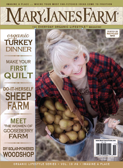 1 1
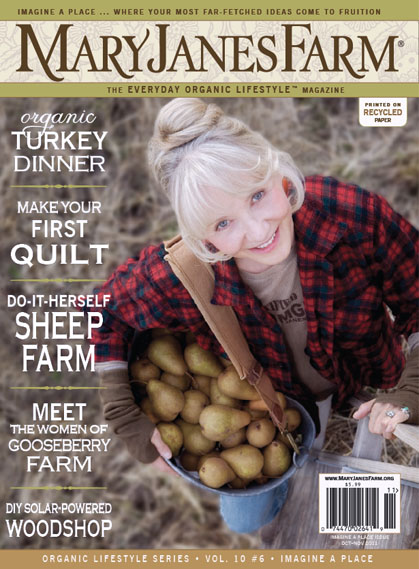 2 2
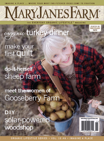 3 3
"Life should not be a journey to the grave with the intention of arriving safely in an attractive and well-preserved body, but rather to skid in sideways, chocolate in one hand, red wine in the other, body thoroughly used up, totally worn out, and screaming 'WOO HOO, what a ride!'"
|
|
|
|
ceejay48
Farmgirl Legend/Schoolmarm/Sharpshooter
13586 Posts
CeeJay (CJ)
Dolores
Colorado
USA
13586 Posts |
Posted - Jul 28 2011 : 2:54:43 PM

|
Carol,
I pick #2 . . .
- it is without the bar but the titles are still listed in an easy-to-read manner and they aren't obscuring the picture of MJ
- the picture of MJ doesn't look like it's "squeezed" onto the cover as it does on #1
Thanks for the opportunity!
CJ
..from the barefoot farmgirl in SW Colorado...sister chick #665
From my Heart - www.fromacelticheart.blogspot.com
From my Hands - www.cjscreations-ceejay.blogspot.com
From my Hubby - www.aspenforge.blogspot.com |
|
|
|
adnama
True Blue Farmgirl

171 Posts
inge
fargo
north dakota
USA
171 Posts |
Posted - Jul 28 2011 : 2:56:52 PM
|
| I would pick cover two, all the info is clearly lined up and easy to scan if I was looking to buy a magazine I had never read before. Looking at issues of mags that I pick up just to check them out, the clarity of the contents enclosed is always what will make me open my wallet to purchuse. |
|
|
|
spaciousplace
True Blue Farmgirl
80 Posts
Mary
Blue Bell
PA
USA
80 Posts |
Posted - Jul 28 2011 : 8:24:52 PM
|
Cover 2, for the same reasons Ceejay48 and adnama listed. :)
Mary :)
Farmgirl Sister #378
|
|
|
|
Acelady02
True Blue Farmgirl
1266 Posts
Penny
Washington
GA
USA
1266 Posts |
Posted - Jul 28 2011 : 8:31:58 PM

|
I just received my first issue but after looking at the pics above I really like it with the bar...but on your second poll, I like the cover # 2....so now I am tore..lol....good luck deciding...Penny
God gives Miracles to those who Believe, Courage to those with Faith, Hope to those who Dream, Love to those who Accept, & Forgiveness to those who Ask...
So Keep Smiling! |
Edited by - Acelady02 on Jul 28 2011 8:36:20 PM |
|
|
|
breadpainting
Farmgirl at Heart
1 Posts
Sunya
Stuttgart
AR
USA
1 Posts |
Posted - Jul 28 2011 : 9:55:07 PM
|
Much easier to read with the bar but "prettier" without. Maybe the text could just have more contrast?
Why are you trying so hard to fit in when you are meant to stand out? |
|
|
|
Alee
True Blue Farmgirl
22937 Posts
Alee
Worland
Wy
USA
22937 Posts |
Posted - Jul 29 2011 : 07:07:10 AM
|
I would pick Number 2.
I loved the wider picture and more open feeling of the picture. The words were a nice contrast with the cover and were set in an area where there was less background noise making them much easier to read.
Cover 3 looked a little sloppy in comparision and the words weren't formatted nicely. Some of them run over and some say in line. And cover 1 while the words look nice, I too feel that it is squeezing MaryJane from the cover and makes the picture almost feel like an afterthought. The bar is too noticiable.
Alee
Farmgirl Sister #8
www.farmgirlalee.blogspot.com
www.allergyjourneys.blogspot.com
|
|
|
|
StrawHouseRanch
True Blue Farmgirl
1044 Posts
Paula
Holt
Missouri
USA
1044 Posts |
Posted - Jul 29 2011 : 07:11:37 AM
|
Definitely #2. You get the entire photo without being squeezed out by the bar, yet it is very easy to read through the subject items.
If you had to go with a bar, try maintaining the whole photo cover, but for the bar area, just tint that section of the photo a little lighter until you get the contrast you need to make the font pop out adequately.
Paula
Farmgirl Sister #3090
A Beehive is the ultimate Home Sweet Home
|
|
|
|
CurlysQuilts
True Blue Farmgirl
569 Posts
Sarah
Northeast Kingdom
VT
USA
569 Posts |
|
|
Betty J.
True Blue Farmgirl
1403 Posts
Betty
Pasco
WA
USA
1403 Posts |
Posted - Jul 29 2011 : 09:00:16 AM
|
I would pick #2. For these "old eyes" the contrast is so much better. Has anyone seen some of this new gray print that is so hard to read? I make mistakes with them all the time. I like #2.
Betty in Pasco |
|
|
|
Blessed in Colorado
True Blue Farmgirl
6480 Posts
Debbie L.
Oregon
USA
6480 Posts |
|
|
KanMogirl
True Blue Farmgirl
349 Posts
Katherine
Rock
Kansas
USA
349 Posts |
Posted - Jul 29 2011 : 11:43:43 AM
|
I like with the bar.
I would rather wear out than rust out.----Richard Cumberland |
|
|
|
SRhea
Farmgirl in Training
42 Posts
Sue
San Angelo
TX
USA
42 Posts |
Posted - Jul 29 2011 : 12:20:57 PM
|
Without the bar.
In one of your magazines you wrote about paper towels and I believe it was under Simple Solutions. I have been trying to find it again to reread it and don't remember what issue it was in. Is it on the website? |
|
|
|
nancypo
True Blue Farmgirl
362 Posts
nancy
boise
idaho
USA
362 Posts |
|
|
mndreamer
True Blue Farmgirl
191 Posts
Vicky
Popple Creek
MN
USA
191 Posts |
Posted - Jul 29 2011 : 1:11:59 PM
|
#2
~Vicky~
Live simply. Love generously. Care deeply. Speak kindly. Leave the rest to God. ~~Ronald Reagan
|
|
|
|
BarnChickCecily
True Blue Farmgirl
673 Posts
Cecily
Corydon
IN
USA
673 Posts |
|
|
Karrieann
True Blue Farmgirl
1900 Posts
Karrieann
Northeast
Georgia
USA
1900 Posts |
|
|
edlund33
True Blue Farmgirl
1480 Posts
Marilyn
Renton
WA
USA
1480 Posts |
Posted - Jul 29 2011 : 9:19:40 PM
|
I like cover #2. It is clean and simple but still gives the viewer a quick reference to what's inside the issue.
Cheers! ~ Marilyn
Farm Girl No. 1100
Do not go where the path may lead, go instead where there is no path and leave a trail. - Ralph Waldo Emerson |
|
|
|
**MaryJanesFarm Products & Merchandise: We need your help with our cover! UPDATE! |
|